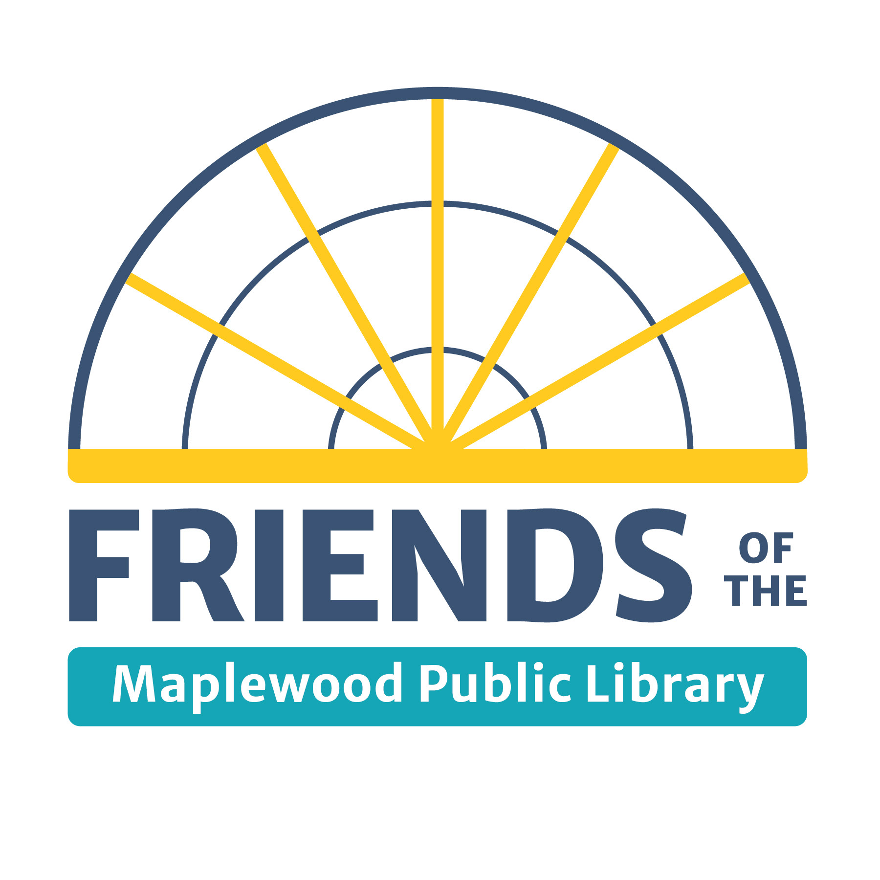
Completed Logo
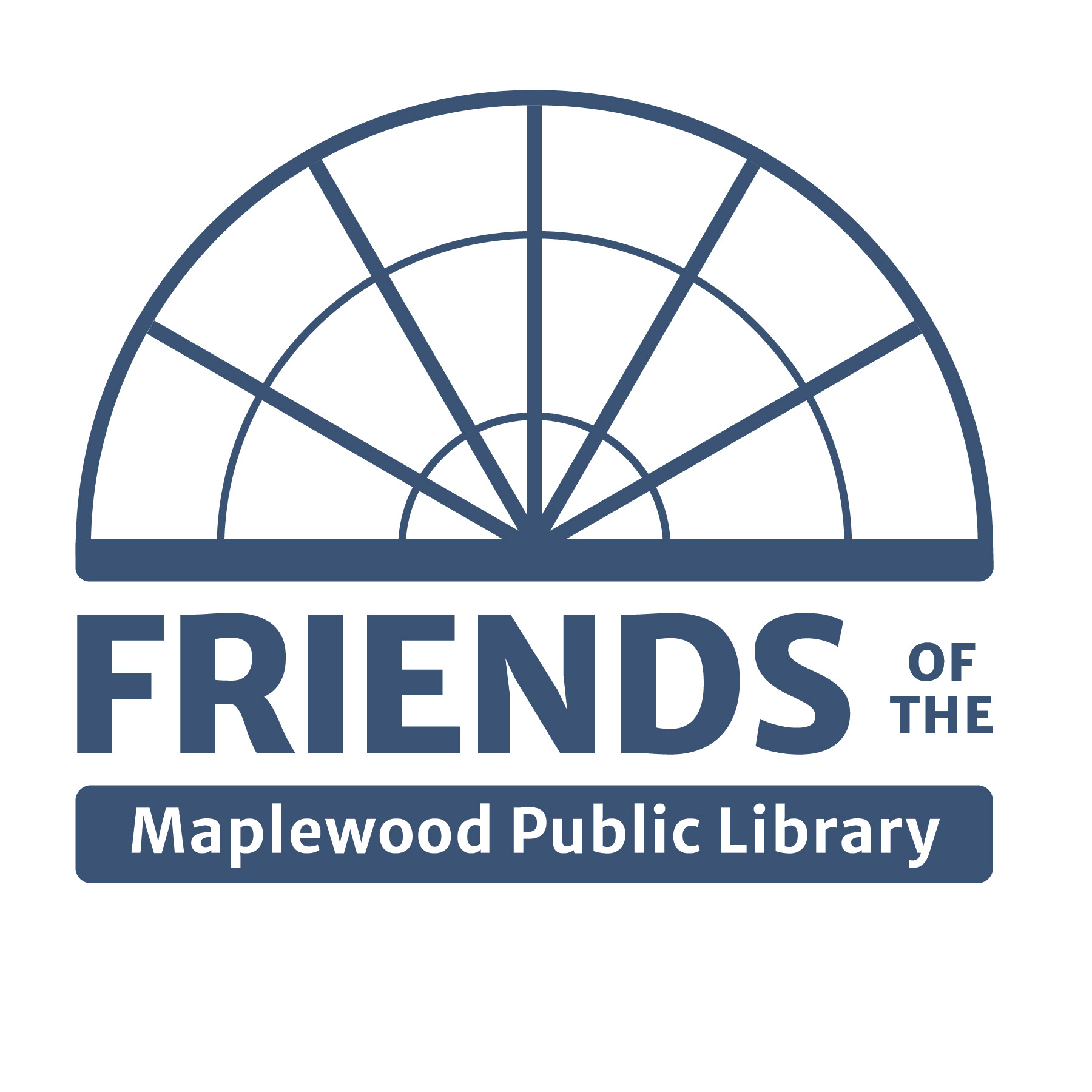
Single Color Variation of the Logo
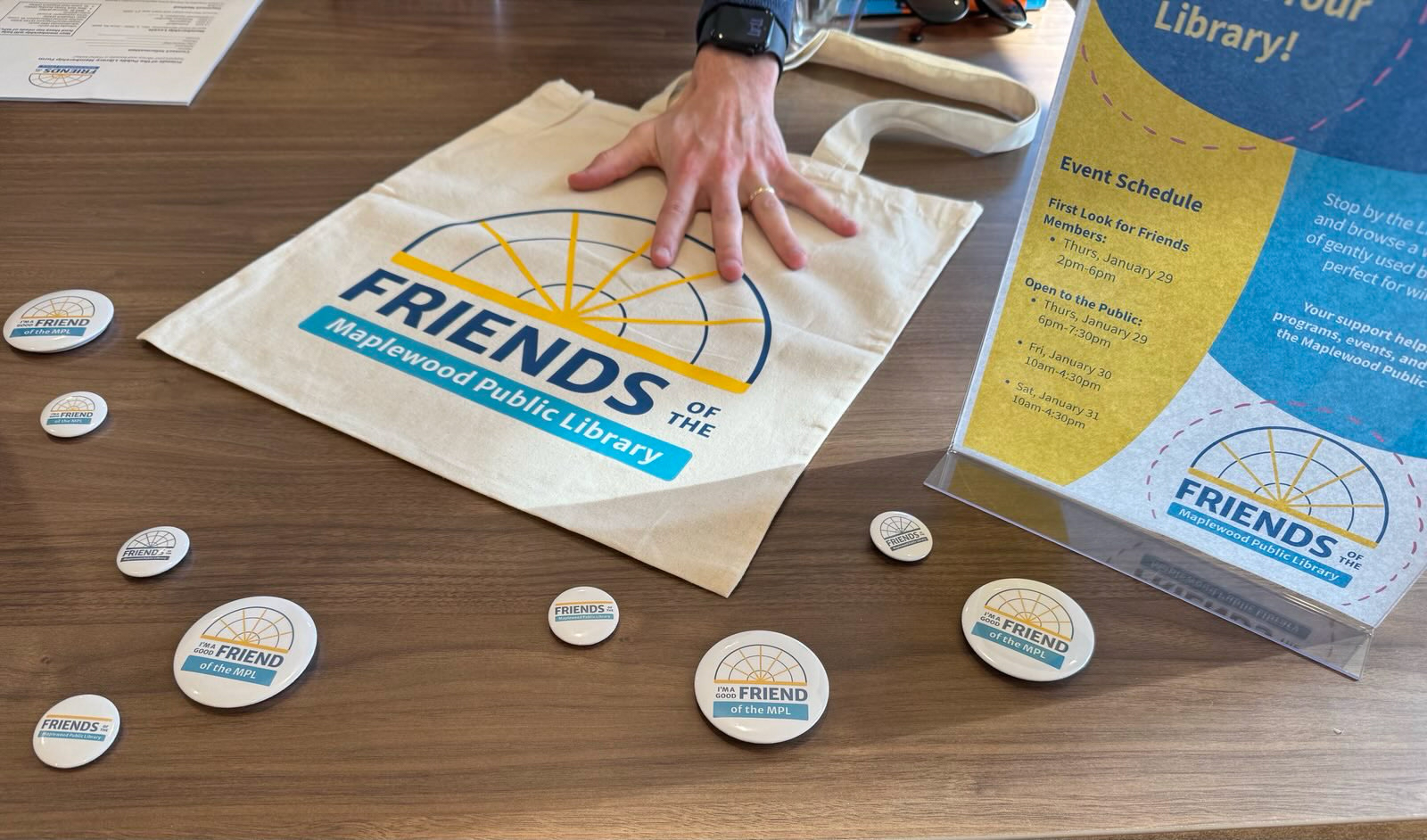
Logo in use on swag
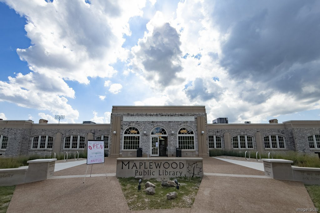
The building and inspiration
In 2025, I was approached by the board of a new organization called Friends of the Maplewood Public Library to create a logo and basic brand guide. The goal of the group is to support the local public library through donations and fundraisers. The identity of the group needed to look good when placed near the library's logo, but also appear very distinctly different from it. Since I had previously worked on the Prop L campaign and drawn the facade of the library, I started with the building's unique architecture as a point of inspiration. The result is a brand icon inspired by the gridded, half-circle windows that equally represents the turning pages of a book.
Completed Logo
Single Color Variation of the Logo
Logo in use on swag
The building and inspiration