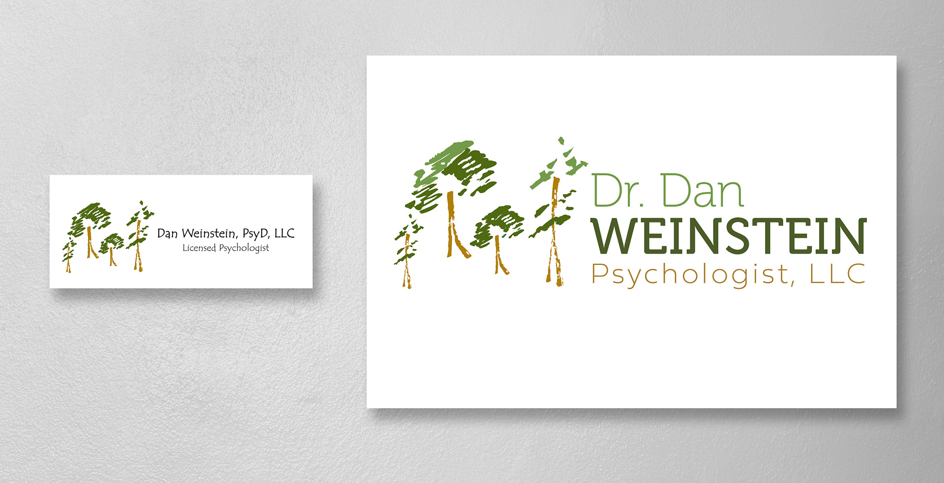
On the left is Dr. Weinstein's old logo. He really liked the trees and what they represented about the growth he could offer his clients, so I only edited the trees, adding more depth through color, and focused my attention on the typography. The old logo utilized a font that attempted to be organic but looked messy and unprofessional. The refreshed logo features two type families—one with uniform stroke widths and unique semi-serifs to match the organic nature of the tree imagery and the other a geometric sans serif to ground the logo in professionalism.
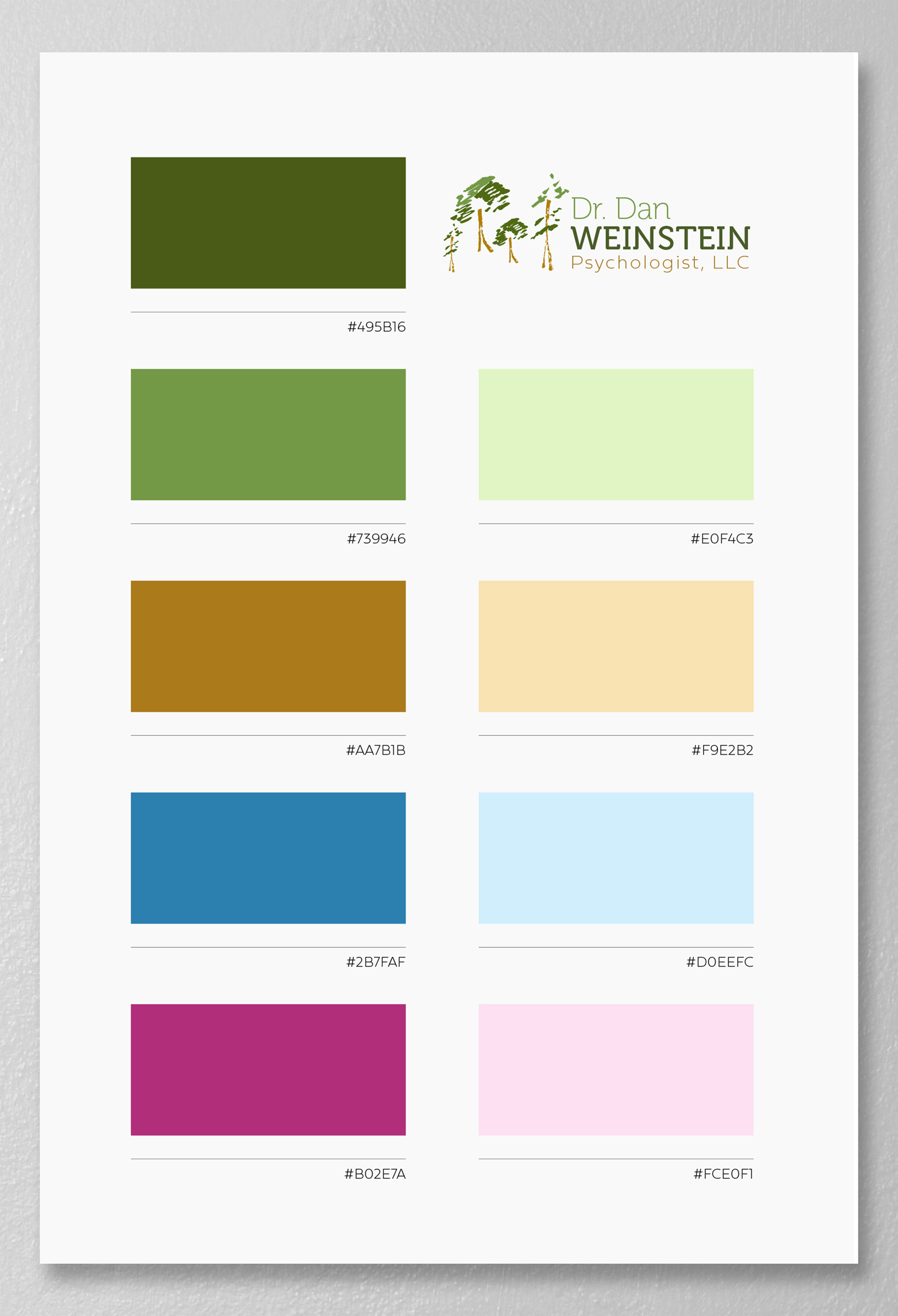
Dr. Weinstein's old website relied heavily on the one shade of green and brown from the trees in his logo. I expanded upon his color palette to bring additional colors one might see in nature in both bright and soft values.
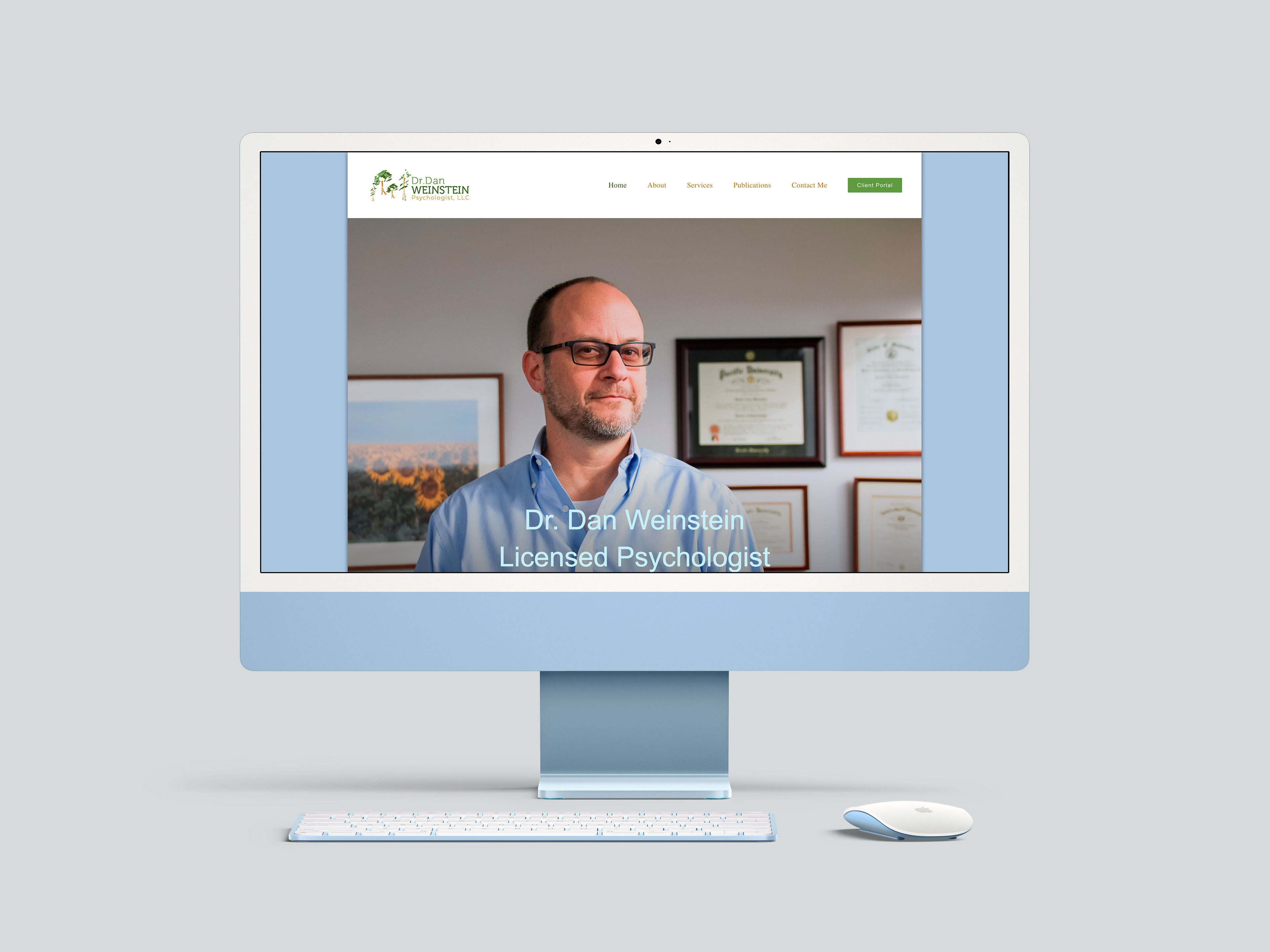
Dr. Weinstein favored a clean and simple aesthetic for his new website. I photographed him in his office to provide prospective patients with a glimpse at the atmosphere of his sessions and capture his professional but approachable style.